
Japandi is a harmonious blend of Japanese minimalism and Scandinavian functionality, a design philosophy that celebrates simplicity, natural beauty, and deeply considered craft. From Japan it borrows wabi-sabi, the beauty of imperfect, aging materials. From Scandinavia it takes hygge, the warmth and contentment of a space that genuinely holds you.
The result is an interior that is minimal but not sterile, calm but not impersonal. Every object earns its place. Every surface has texture. Every room feels like a quiet exhale.
In the Philippines, Japandi adapts beautifully. Rattan, capiz, abaca, Philippine hardwood, and handwoven solihiya panels are Japandi materials in their most honest, locally grounded form. The Filipino instinct for open, ventilated layouts maps directly onto Japandi’s preference for airy, connected spaces.

The key is the relationship between mass and space. Japandi furniture tends to sit low: low beds, low tables, low shelving. This creates a horizontal pull across the room, making ceilings feel taller and the floor plan feel wider without changing a single dimension.
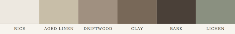
Warm neutrals anchor the palette. The warmth prevents the space from feeling clinical. The neutral keeps it quiet. When you add one grounded accent, a moss-green throw, and a clay pot — the room absorbs it without visual conflict.
Japandi uses natural materials not for visual texture alone but for tactile contrast. Smooth plaster beside raw linen. Dense stone beside light rattan. This interplay communicates that everything in the space was intentional, nothing was placed by default.
Lighting is indirect and warm. The goal is to eliminate harsh shadows, not maximize brightness. In tropical climates, this logic extends to controlling natural light; shoji-like diffusion through frosted panels or woven blinds softens the Philippine sun without blocking it entirely.
Best for: Homeowners who feel overwhelmed by clutter, who want their home to be the most restful place in their day, and who appreciate beauty in natural imperfection.
Read the full guide: Japandi Interior Design in the Philippines

Where Japandi leans toward the Japanese side of restraint and wabi-sabi, Scandinavian design is warmer and more expressive. Layered textiles. Soft rugs. Candles and warm-toned lighting. The feeling of a home that wraps around you on a cool evening.
In the Philippines, Scandinavian design needs thoughtful adaptation. The all-white-and-pale-ash palette can feel washed out under intense tropical sunlight. The best Filipino interpretations warm the palette with local materials: acacia wood instead of birch, abaca textile accents instead of wool throws, rattan instead of wicker, and warm amber lighting that compensates for what the color palette softens.
White is not a neutral choice in Scandi design — it is a deliberate light amplifier. Pale floors, white walls, and light wood tones create a continuous surface that bounces light around the room. Even on overcast days, this keeps spaces feeling open and alive.
White is not a neutral choice in Scandi design — it is a deliberate light amplifier. Pale floors, white walls, and light wood tones create a continuous surface that bounces light around the room. Even on overcast days, this keeps spaces feeling open and alive.
Hygge is not a visual style. It is a feeling of warmth and togetherness created by the arrangement of space. A reading nook beside a window. A dining table sized for gathering, not display. Rugs that define a seating zone on open concrete floors.
This is why Scandinavian rooms feel lived-in without feeling cluttered. Objects are chosen because they perform a function and do it beautifully. Decorative objects earn their place by also being useful — the ceramic mug, the woven basket, the wooden tray.
Read the full guide: Scandinavian Interior Design in the Philippines

Filipino minimalism in 2025 has evolved into a warmer, more welcoming aesthetic that combines clean structure with biophilic elements, warm neutrals, and natural materials like wood, rattan, and handwoven textiles. This is not the cold, stark white minimalism of early 2010s design blogs. It is a warmer, more grounded discipline.
Every piece of furniture earns its place. Every surface tells the truth about what it is made of. Built-in storage hides what does not need to be seen. The room breathes because it has been given room to breathe.
For Filipino homeowners in Metro Manila and other dense urban areas, where lots are shrinking and daily life generates enormous visual noise, minimalism is both an aesthetic choice and a quality-of-life investment. Less to look at means more room to think.
When there is nothing to visually process except the room itself — its proportions, the quality of its light, the texture of its walls — your nervous system shifts from scanning mode to resting mode. The calm is not decorative. It is neurological.
Warmth in minimalist spaces comes from material choice, not quantity. A single raw linen curtain introduces more warmth than ten decorative cushions. The eye is not looking for more to process — it is resting on what is there.
The biggest failure in minimalist interiors is mistaking emptiness for minimalism. Empty spaces look unfinished. Minimalist spaces look intentional. The difference is in the quality of what is present — the proportions of furniture to room volume, the weight of materials, the resolution of every visible edge and joint.
In floor plan terms, minimalism requires that storage be part of the architecture. Open storage is not minimalist. Integrated cabinetry, recessed shelving, and concealed utility zones are what allow surfaces to remain clear without sacrificing function.
Best for: Urban homeowners, condo dwellers, and anyone who wants their home to feel spacious, calm, and genuinely easy to maintain.
Read the full guide: Minimalist Interior Design in the Philippines

Bohemian style is one of the most misunderstood aesthetics in interior design because it looks like chaos from the
Bohemian design is the antithesis of minimalism. It layers. It collects. It mixes eras, textures, patterns, and cultures without apology. A macrame wall hanging above a rattan daybed. Moroccan-patterned cushions on a carved Philippine hardwood bench. Terracotta plant pots on a vintage aparador. A gallery wall that mixes family photos with folk art and abstract prints.
For Filipino homeowners who have a natural collecting instinct, who are drawn to handmade objects and inherited pieces, and who feel suffocated by the restraint of minimalism, bohemian design is deeply liberating. The key is curation rather than accumulation: a loose color story that ties the eclecticism together, and a discipline about what actually earns wall or shelf space.
outside. Stacked rugs, mixed textiles, layers of pattern, eclectic objects on every surface. But there is a logic underneath it, and that logic is accumulation over time — not decoration in one go.
What makes bohemian spaces feel rich rather than overwhelming is tonal anchoring. Even when five different patterns appear in one room, they share a temperature — all warm earths, or all dusty muted tones. Pattern diversity is held together by color family coherence.
Textiles do most of the work. A kilim rug sets the base temperature. Cushions, throws, and curtains build on it. Each layer adds visual weight without adding furniture, which keeps movement easy through the space.
buying a complete boho kit from one store. The aesthetic depends on objects with different origins and ages. An old family mirror beside a rattan chair beside a thrifted ceramic — these objects read differently because they have different visual weights and histories.
Natural light works well in bohemian spaces because layered materials respond to it differently. The same afternoon light that flatters a linen curtain will also deepen the tone of a terracotta wall and warm a jute rug — the whole room shifts together.
Best for: Creative, expressive homeowners who love travel, art, and handmade objects, and who want their home to tell a story about who they are and where they have been.
Read the full guide: Bohemian Interior Design in the Philippines

Mid-century modern emerged from a very specific cultural moment — post-war optimism, new materials, and the belief that good design should be available to everyone. The furniture of the 1950s and 60s was not just stylish; it was a political statement about democratizing beauty. Understanding that origin explains why the aesthetic still resonates: it is confident, forward-looking, and fundamentally cheerful.
Mid-century modern furniture is defined by organic curves on geometric frames. Splayed legs. Tulip bases. Egg-shaped chairs. These forms came from new manufacturing processes — molded plywood, fiberglass, cast aluminum. The shapes were not arbitrary; they were what the materials wanted to do.
In a room, this geometry creates visual lightness. Furniture on splayed or tapered legs shows floor beneath it — the room breathes. Compare this to furniture that sits flush to the floor, which makes the same room feel lower and heavier.
Mid-century modern uses bold accent colors — tangerine, teal, mustard, avocado — against a neutral walnut-and-cream base. The palette is confident but not overwhelming because the bold color is contained to one or two pieces. An orange Eames chair in a room of pale walls and walnut floors reads as a point of joy, not a statement of excess.
This is a useful pattern for Philippine homes where owners want color but worry about commitment — a single accent piece anchors the room’s energy without requiring everything to change if tastes shift.
Read the full guide: Mid-CenturyInterior Design in the Philippines
Wabi-sabi is not a design style in the way that minimalism or maximalism are design styles. It is a philosophy about the nature of things — that beauty is inseparable from impermanence and imperfection. In practice, it produces spaces that feel deeply settled because nothing in them is pretending to be new or perfect.
The cracked ceramic bowl. The rough plaster wall with visible trowel marks. The wooden beam showing its grain and knots. In wabi-sabi, these are not defects — they are evidence that the material is real and that time has touched it.
This is the opposite of the Instagram-perfect finish. Wabi-sabi spaces look like they have been lived in, not styled. They communicate stability: this place has existed through many seasons and will continue to exist through many more.
Aged materials absorb light differently than new ones. They scatter it rather than reflect it. A room full of wabi-sabi materials — worn wood, matte ceramics, rough stone — has a quality of light that feels calm because nothing is reflecting back a sharp image. The room holds light rather than throwing it.
Wabi-sabi also favors asymmetry. A lone branch in a ceramic vase rather than a symmetrical floral arrangement. One painting off-center rather than a grid of three. Asymmetry reads as natural rather than arranged, and that naturalness is the aesthetic’s core emotional register.
Read the full guide: Wabi-Sabi Design in the Philippines
The common version of coastal design — anchor motifs, nautical ropes, shells in a bowl — misses the point. Real coastal design is about what a life near the water actually feels like: the openness, the quality of reflected light, the constant movement of air. Good coastal interiors replicate that feeling, not its symbols.

Coastal design works with the natural properties of light near water — its brightness, its reflection off pale surfaces, its movement through billowing curtains. This means light furniture, pale or bleached finishes, and window treatments that diffuse rather than block.
Cross-ventilation matters as much as visual design. A coastal-style room that cannot breathe fails the core principle. Wide openings, louvered windows, and furniture arranged to allow air flow are structural decisions that define the aesthetic before color or material ever enters the picture.
Rattan, sea grass, jute, bleached wood, linen, stone — these materials carry the weight appropriate to a space that should feel effortless. Heavy, dark, or polished materials pull against the lightness that coastal design requires.
Color in coastal design is pale and cool with warm sand tones grounding it. All-blue is a trap — it reads as themed rather than elemental. The palette should feel like the actual proportions of a coastline: mostly sand and sky, with water as the accent.
Industrial design emerged not as an aesthetic choice but as an economic one. When artists and young professionals began occupying abandoned warehouses and factories in New York and Chicago in the 1970s, they could not afford to finish the spaces. Exposed brick, concrete floors, raw steel pipes, and unfinished ceilings were what they had. The aesthetic came from working with the bones of a building instead of hiding them.
Industrial design is structurally honest — it shows what a building is made of rather than concealing it. Exposed ductwork is not decorative; it is the actual ductwork. Concrete floors are not a finish choice applied over structure; they are the structure, polished.
This matters for how the space communicates. Industrial rooms feel substantial and permanent because you can see the material logic. Nothing is hidden. The room reads its own function into its appearance.
The failure mode of industrial design is a space so cold and hard that it is uncomfortable to inhabit. The resolution is warmth introduced through contrast: leather or velvet upholstery against steel frames. Warm Edison bulb lighting against grey concrete. Raw wood tabletops on iron bases. A Persian rug on a polished concrete floor.
Each warm element is sharper and more effective because of what surrounds it. The contrast is the design principle, not an aesthetic quirk.
Read the full guide: Industrial Interior Design in the Philippines
Maximalism is not the absence of restraint. It is restraint applied differently — not to how much is present, but to how all of it holds together. The difference between maximalism and clutter is the same as the difference between an orchestral composition and noise: in one, everything is placed in deliberate relationship to everything else.
The organizing principle of maximalist design is usually one of three things: a dominant color palette that unifies disparate objects; a consistent period or provenance — Art Deco, Victorian, 1970s kitsch — that gives the collection a shared visual language; or a strong architectural frame — dark walls, high ceilings, grand proportions — that absorbs visual complexity without breaking.
Pattern mixing works in maximalism because patterns share color families. A blue-and-white toile against a blue floral does not clash — it layers. Strip either of its blue and it breaks. The color is the grammar that makes the patterns readable together.
Maximalist rooms are dense by design. They are meant to reward looking. Unlike minimalism — which creates a restful visual field — maximalism creates a rich one. The eye never exhausts the room because there is always more to discover.
This requires that traffic flow and functional zones remain clear. Even in the most layered maximalist interior, you should be able to enter, move through, and sit down without obstruction. The objects serve the room; the room serves the people in it.
Read the full guide: Industrial Maximalist Design in the Philippines
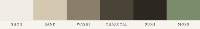
Japandi are defined by muted earthy palettes (warm grays, clay, charcoal, and sage), natural materials like wood, rattan, linen, and bamboo, low-profile furniture close to the ground, minimal ornamentation, and handcrafted objects that carry visible maker’s marks. The result is a serene, timeless aesthetic — calm without feeling cold, minimal without feeling empty.
Yes, and most beautiful Filipino homes do exactly that. The key is intentionality: a unifying color story, a consistent material thread, or a clear spatial logic that ties diverse elements together.
Japandi and biophilic design layer naturally. Minimalist and modern Filipino design complement each other. Bohemian and maximalist Filipino are close cousins. Industrial and tropical modern create a compelling tension that many Filipino designers are exploring right now.
What does not work is mixing without awareness. An eclectic home is a home where every element was chosen deliberately. A confused home is one where different styles collided accidentally.
Minimalist design is among the most budget-friendly styles because it requires fewer pieces, better chosen. The discipline of buying less, but better, reduces the total spend while producing a more considered result.
Modern Filipino and Filipino maximalist design are also cost-effective when sourced locally. Furniture from Guadalupe, Cebu, textiles from indigenous weavers, pottery from Liliw, and heirloom pieces repurposed rather than replaced produce interiors that are rich in cultural value and often surprisingly affordable compared to imported alternatives.

The Philippines' curated directory connecting homeowners, architects, interior designers, and property professionals who believe in the beauty of thoughtful living.
HOUSE DESIGNS
DIRECTORY
COMPANY